building a Brand for
Generational Change
PROJECT SUMMARY
Rooted to Last partnered with Light Codes to develop a new brand identity, website foundation, and visual communication system that could reflect the organization's vision for long-term social justice infrastructure and generational change.
The engagement included brand strategy, visual identity design, custom illustrations, framework visualization, print materials, and website brand direction, creating a cohesive foundation for communicating complex ideas and supporting the organization's continued growth and impact.
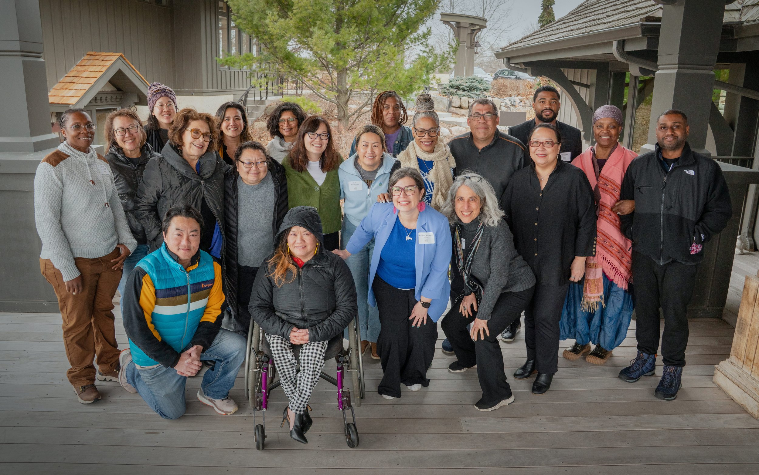
“I deeply appreciated Light Codes commitment to quality, partnership, process, and outcome. I look forward to working with them again and highly recommend them to anyone looking for a thoughtful, creative, and reliable partner.”
— BO THAO-URABE, FOUNDER OF ROOTED TO LAST
THE OPPORTUNITY
As Rooted to Last evolved, leadership recognized the need for a stronger brand and digital presence that more accurately reflected the depth of their work and the future they were helping create.
The existing identity lacked a visual language capable of expressing the interconnected relationships, systems, and long-term transformation at the heart of the organization's mission. The challenge was not simply creating a new logo or website. It was developing a brand capable of communicating both the visible outcomes and the often-unseen foundations that make lasting change possible.
OUR APPROACH
Rooted to Last wanted a brand that felt future-forward, vibrant, and approachable while remaining deeply connected to the communities it serves.
Through strategy and collaborative exploration, we identified themes of resilience, interconnectedness, stewardship, growth, and collective possibility. The resulting direction balanced meaning with momentum, creating an identity that felt bold enough to support the organization's vision while remaining human and accessible.
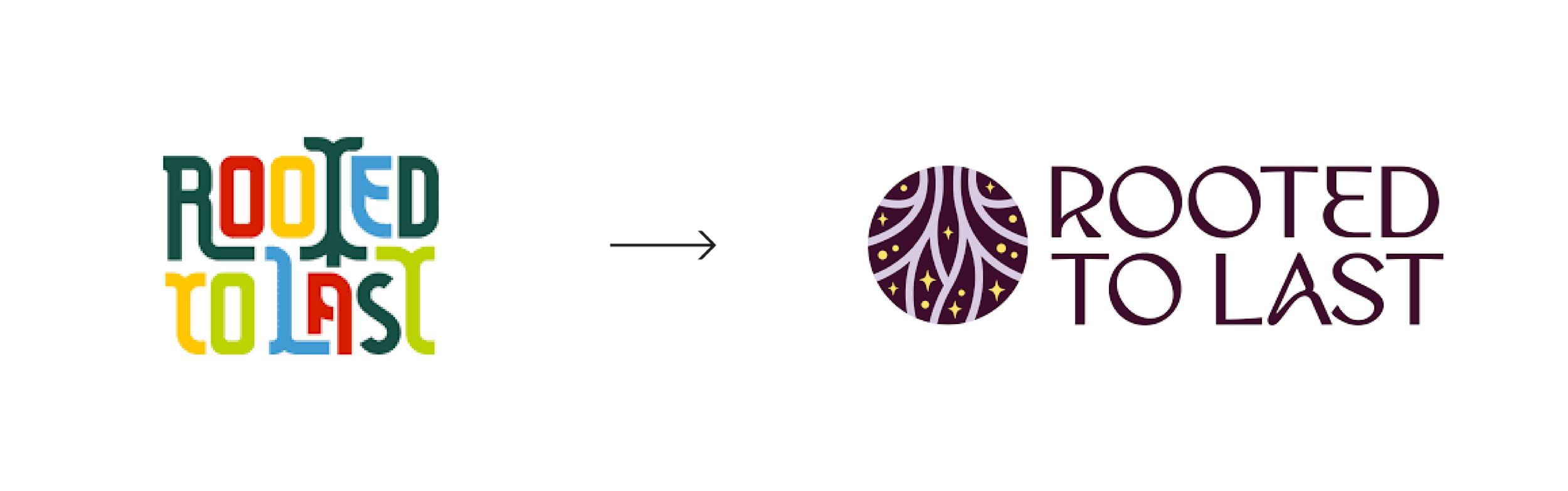
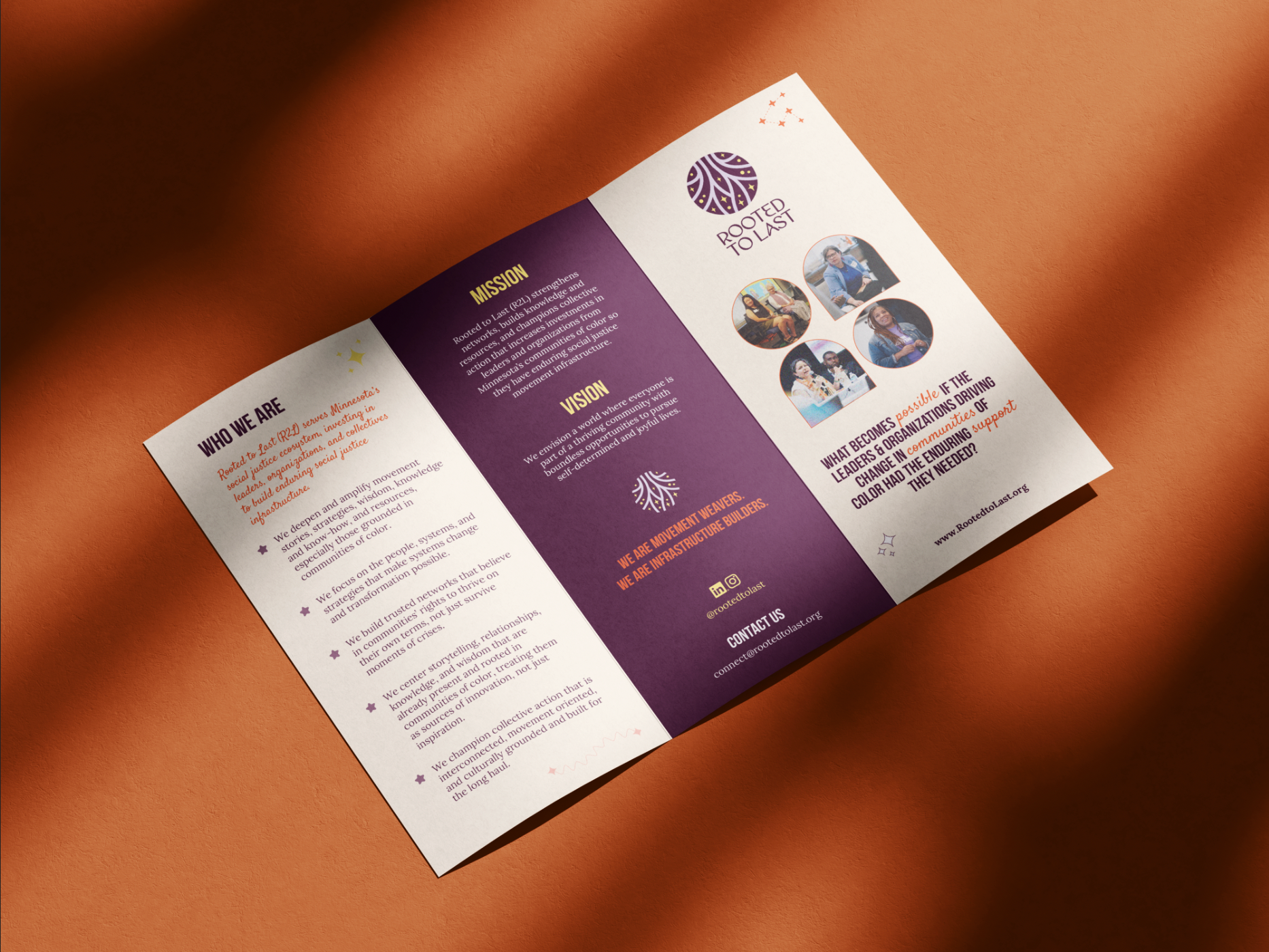
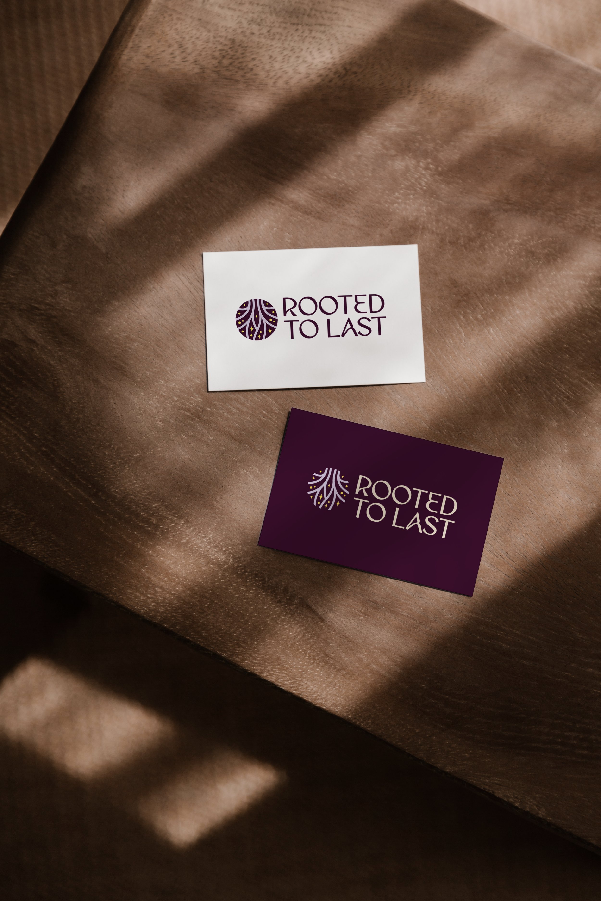
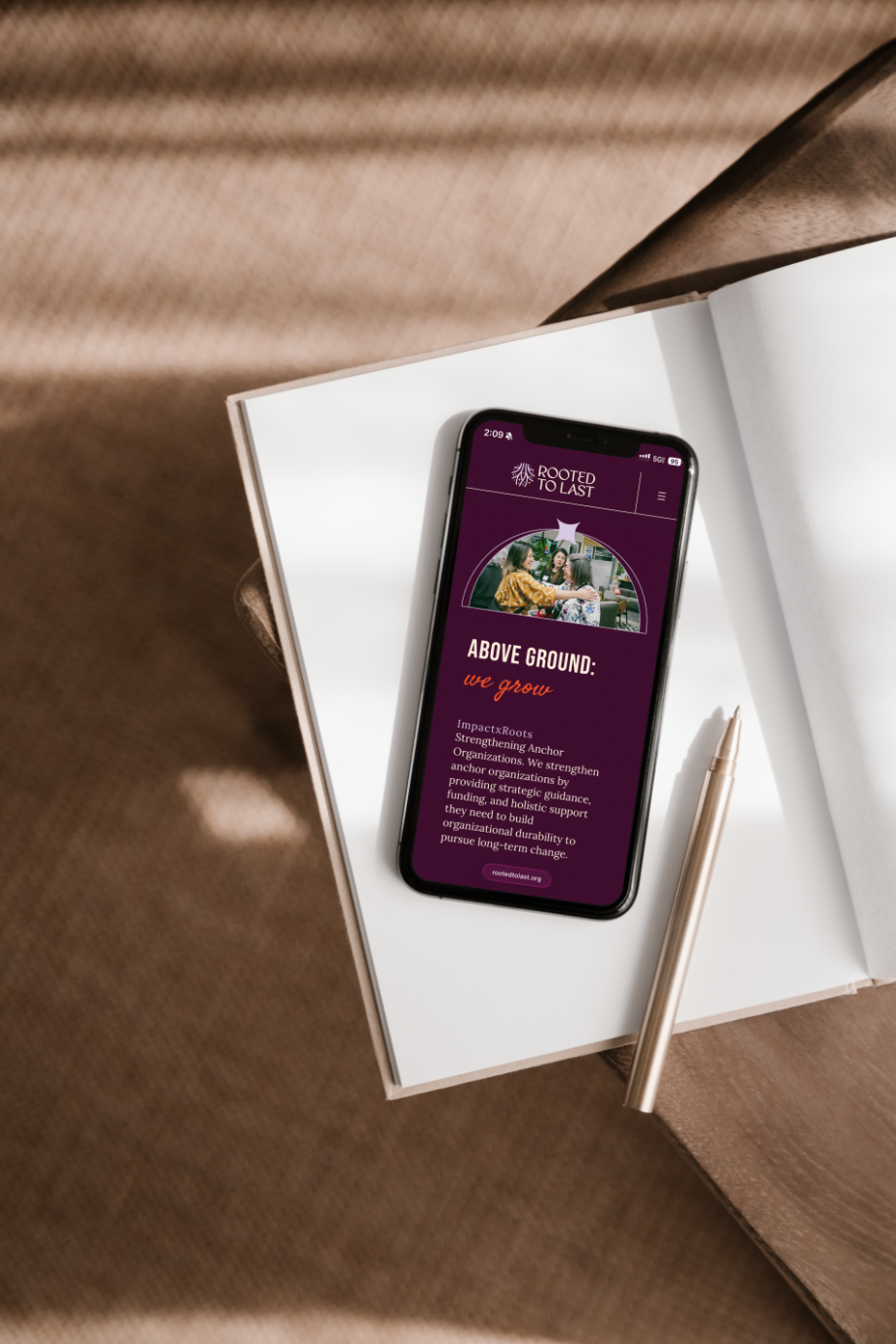
A BRAND ROOTED IN THE FUTURE
At the heart of the identity is a custom symbol inspired by the strength, wisdom, and interconnected nature of trees.
The concept of roots emerged as a powerful metaphor for the organization's work. Just as healthy trees rely on strong root systems to grow and endure, Rooted to Last focuses on cultivating the relationships, leadership, knowledge, and infrastructure that allow communities and movements to thrive across generations.
The symbol combines root-inspired forms with upward movement, creating a visual expression of both groundedness and possibility. Stars were incorporated to represent future generations, collective aspiration, and a vision for a more just and flourishing future. Together, the roots and stars create a bridge between foundation and future, honoring the work required today while holding a vision for what is possible tomorrow.
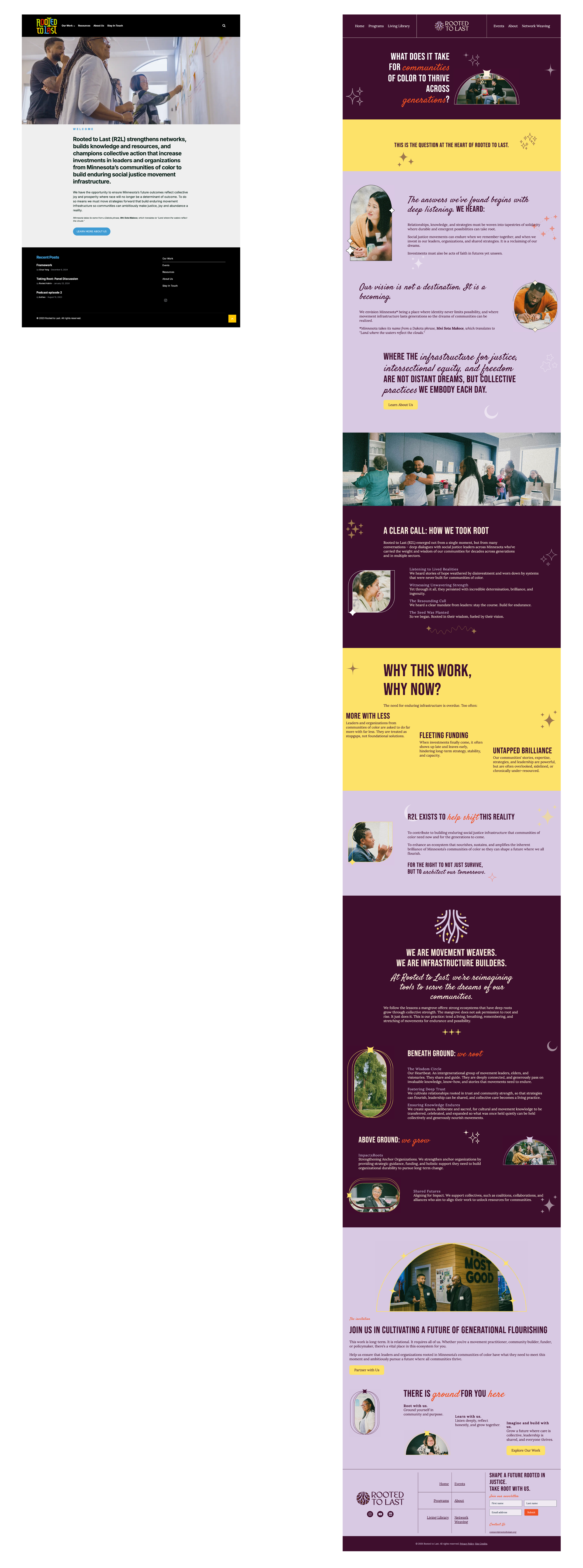
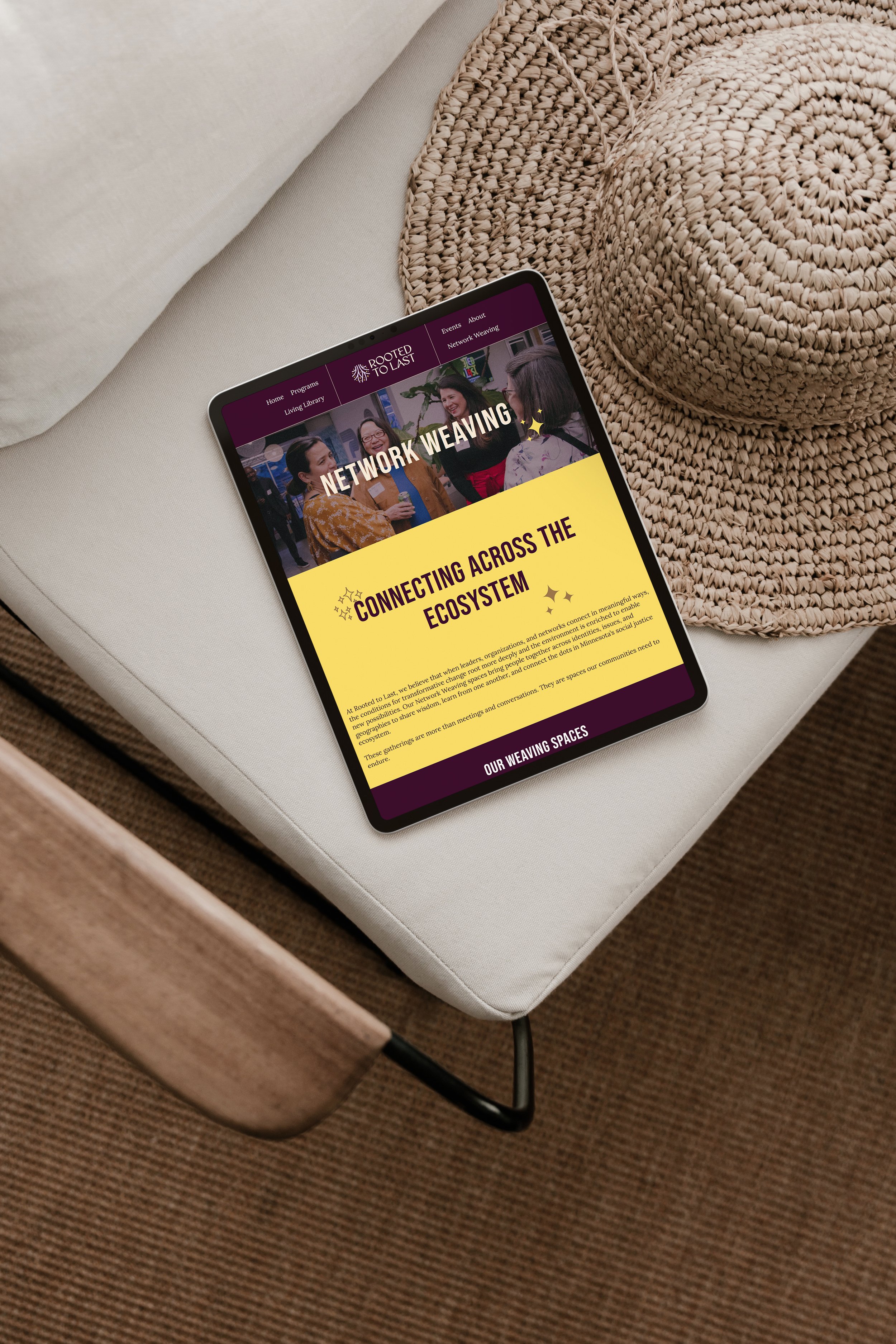
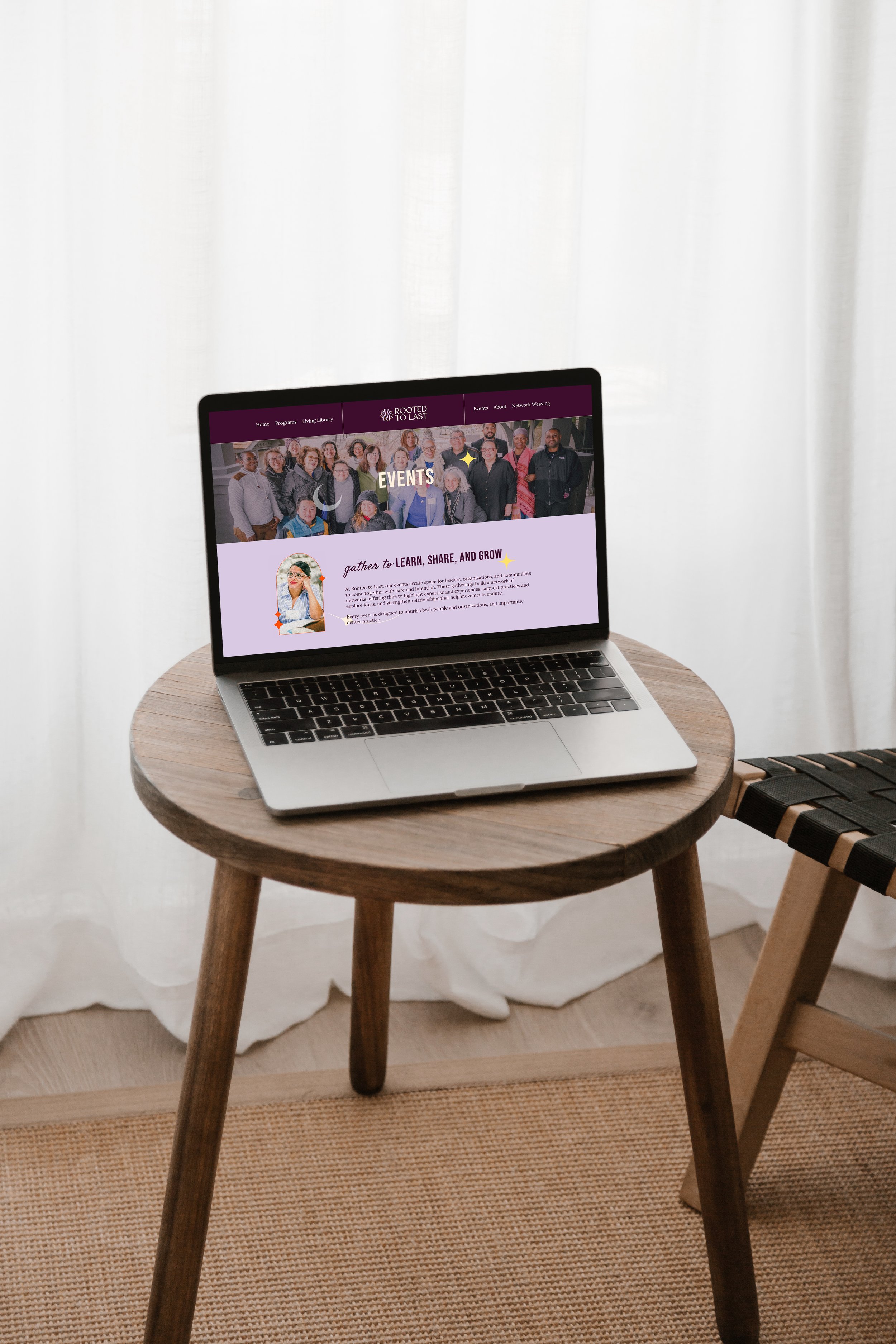
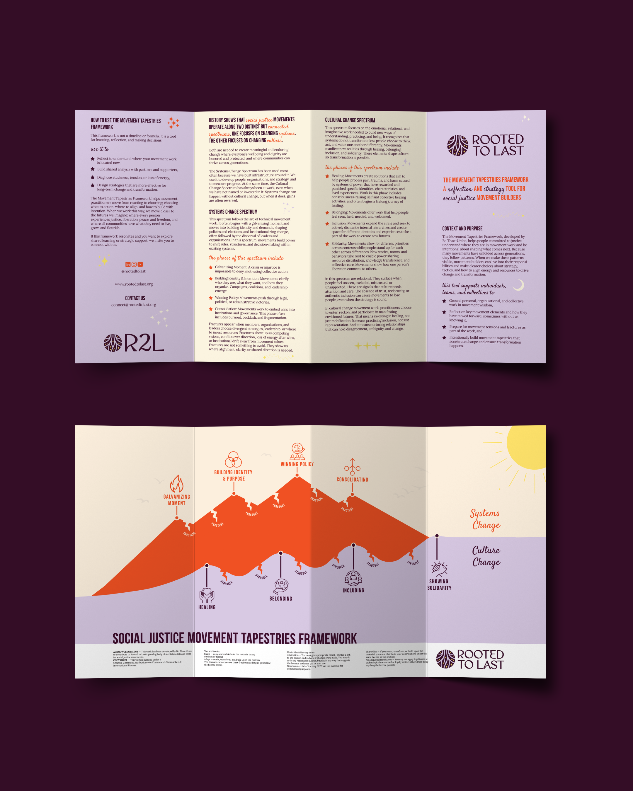
FROM IDENTITY TO VISUAL LANGUAGE
The identity became the foundation for far more than the logo itself.
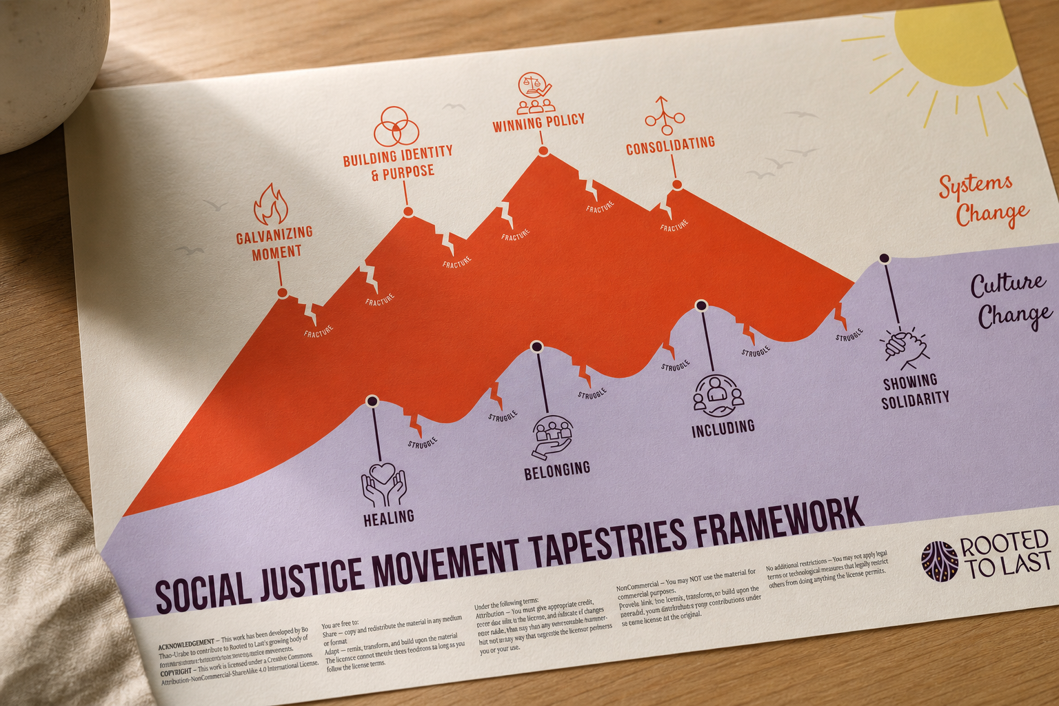
Once the core symbolism was established, themes of roots, constellations, landscapes, pathways, and interconnected systems were extended across the organization's frameworks, educational materials, illustrations, print collateral, and marketing communications.
This created a cohesive visual language capable of communicating complex ideas in ways that felt intuitive, engaging, and aligned with the organization's message. Every element reinforced the same underlying story, helping audiences better understand how people, relationships, organizations, and systems work together to create lasting change.
The result was a connected visual ecosystem that supported communication, education, and shared understanding across the organization.
Project Scope
Brand strategy, visual identity, sacred geometry, custom illustrations, framework & diagram design, brand application consulting, marketing materials
Project details
The outcome
The final brand system provided Rooted to Last with a stronger and more cohesive foundation for communication, storytelling, and future growth.
The identity extended across the website, framework materials, illustrations, and organizational communications, creating greater consistency and recognition across touchpoints. More importantly, it gave leadership a visual language capable of expressing both the depth of the work and the future they are helping build.
The result is a brand that feels aligned with the organization's mission while providing a foundation for continued impact, engagement, and generational change.
Before and After