From Grassroots Movement
to National Impact
PROJECT SUMMARY
MN8 partnered with Light Codes to develop a new brand identity and digital foundation that reflected the organization's evolution from a grassroots movement into a nationally recognized nonprofit advancing justice, dignity, and liberation for Southeast Asian communities.
The engagement included brand strategy, visual identity design, sacred geometry integration, custom illustrations, and website brand direction. The result was a cohesive and culturally meaningful identity system designed to support continued growth, advocacy, fundraising, and community impact.
THE OPPORTUNITY
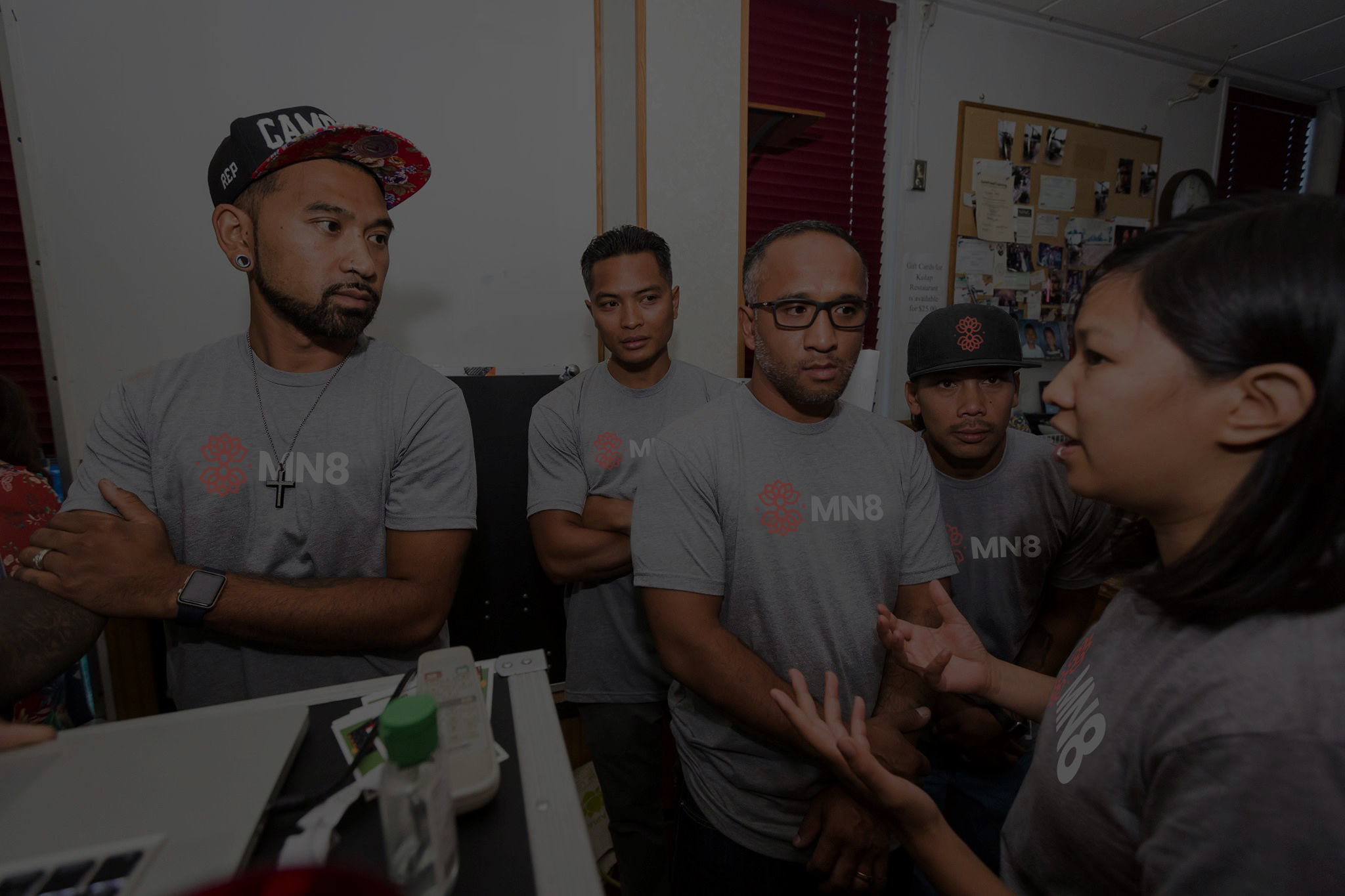
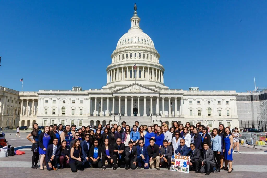
MN8 emerged from the Minnesota 8 movement and has grown into a powerful force for community organizing, leadership development, advocacy, and systems change.
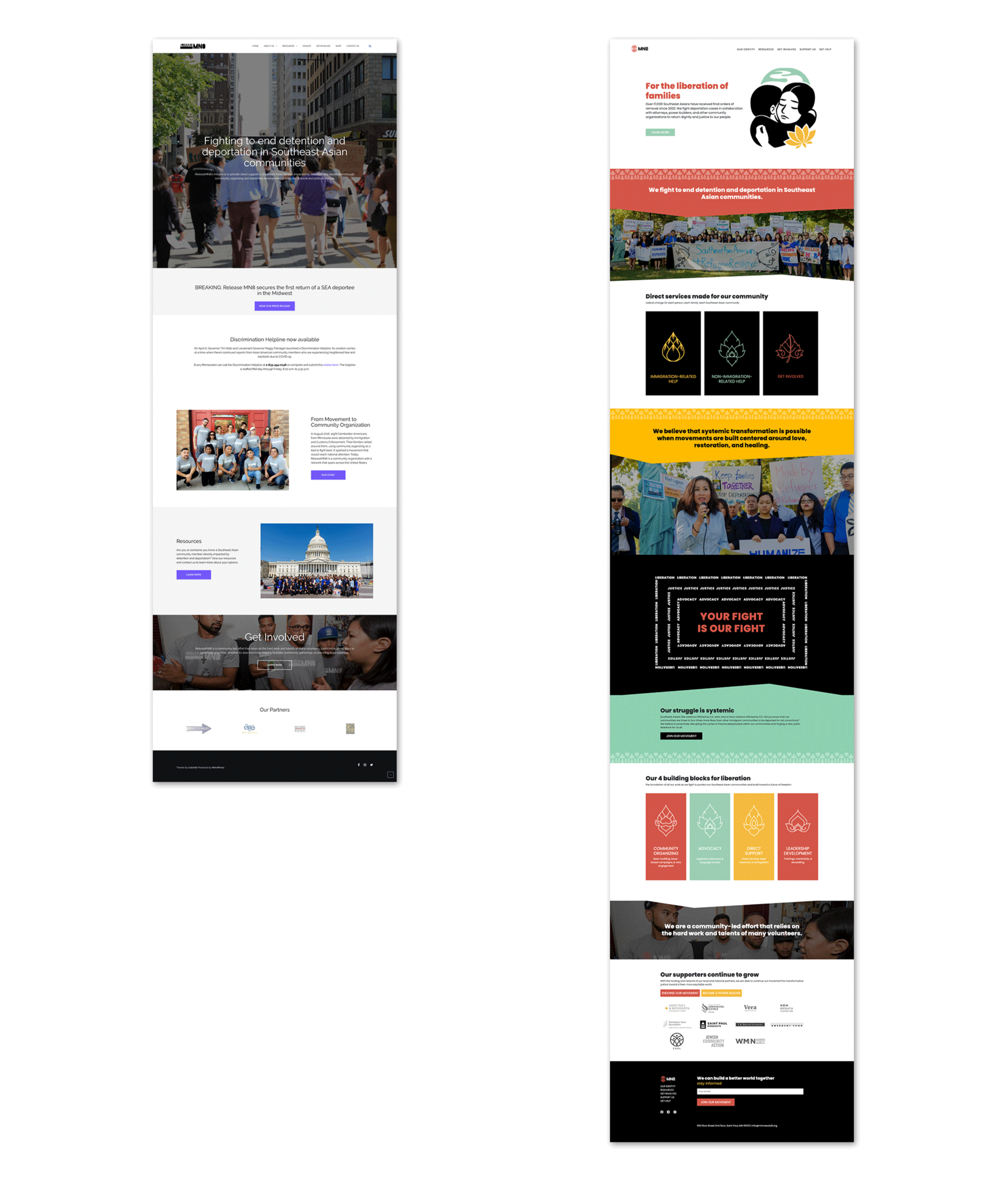
As the organization expanded its reach and influence, its brand and website no longer reflected the depth of its work or the scale of its vision. The existing website had been built as a DIY solution during an earlier stage of growth and lacked the cohesion, credibility, and flexibility needed to support broader visibility and long-term expansion.
The challenge was not simply to modernize the organization's appearance. It was to create a brand that could honor the movement's history while providing a stronger foundation for its future.
OUR APPROACH
We believe the strongest brands are not invented. They are uncovered.
Rather than imposing a new identity onto the organization, our process focused on understanding the values, aspirations, and stories that had shaped the movement from the beginning. Through strategy, visual exploration, and collaborative dialogue, we identified recurring themes of resilience, transformation, belonging, advocacy, and collective power.
The goal was to create a visual language that could communicate not only what MN8 does, but what it stands for.
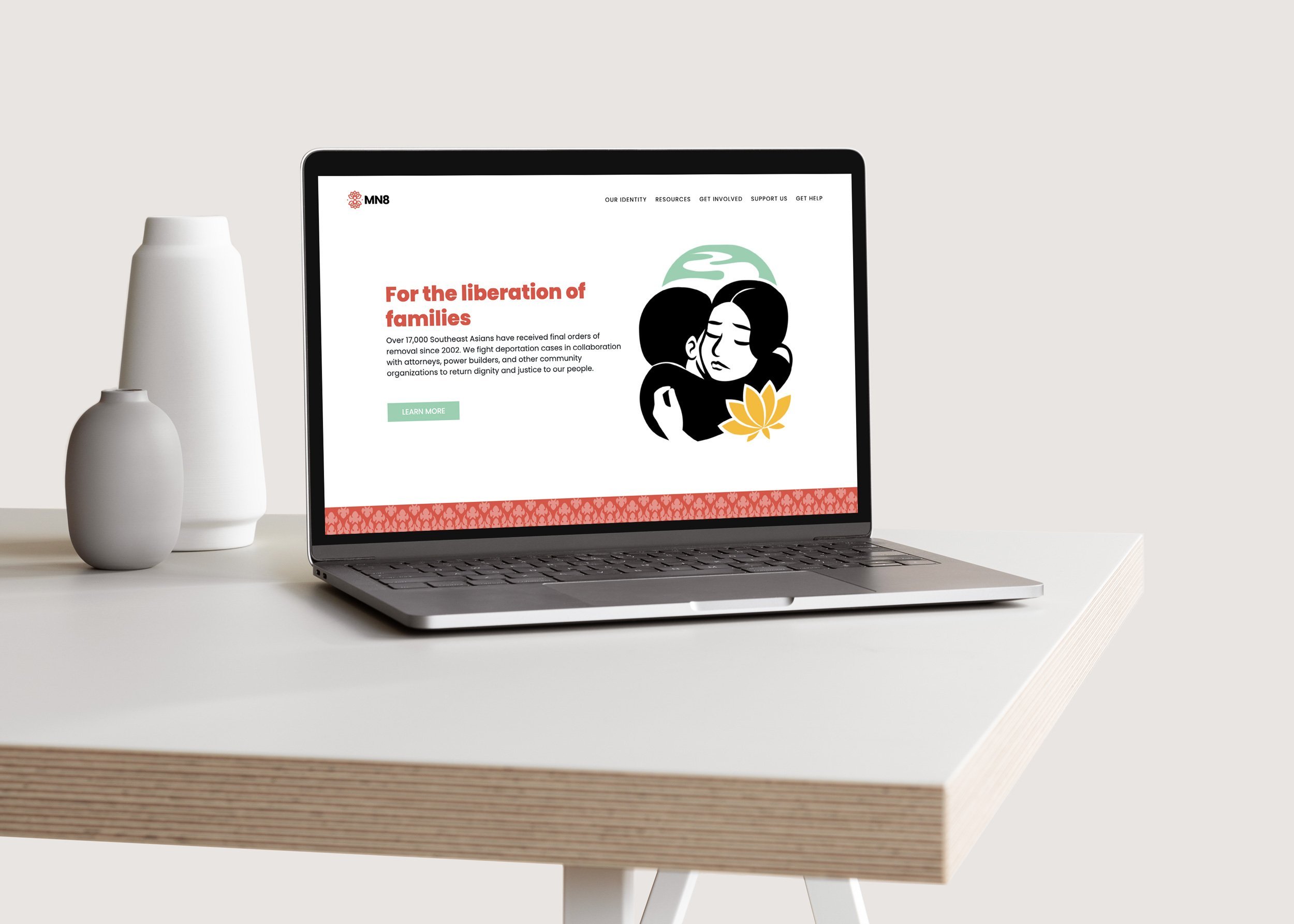
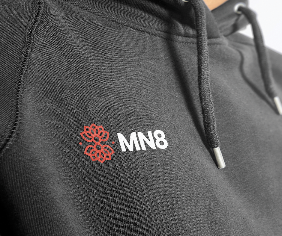
A SYMBOL OF COLLECTIVE POWER
At the center of the identity is a custom symbol designed to embody the organization's history, purpose, and vision for the future.
The mark integrates the number eight in honor of the original Minnesota 8, an infinity form representing collective liberation and enduring possibility, and two lotus forms symbolizing resilience, growth, and transformation.
The geometry was intentionally developed to create a sense of balance, interconnectedness, and expansion, reflecting the organization's belief that meaningful change happens through community rather than individual action alone.
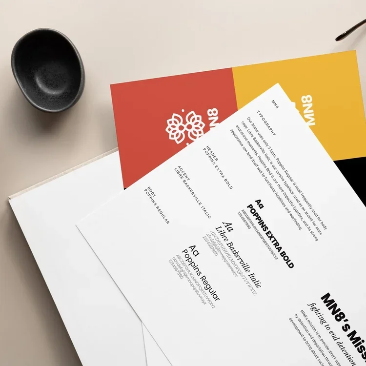
To further strengthen the connection to culture and identity, Southeast Asian-inspired patterns and visual motifs were thoughtfully integrated throughout the broader brand system. These elements created a visual language that feels both distinctive and deeply rooted in the communities the organization serves.
Together, the identity honors where the organization came from while expressing the future it is helping create.

Project Scope
brand strategy, visual Identity, sacred geometry, marketing collateral, illustrations, brand application consulting
Project details
THE OUTCOME
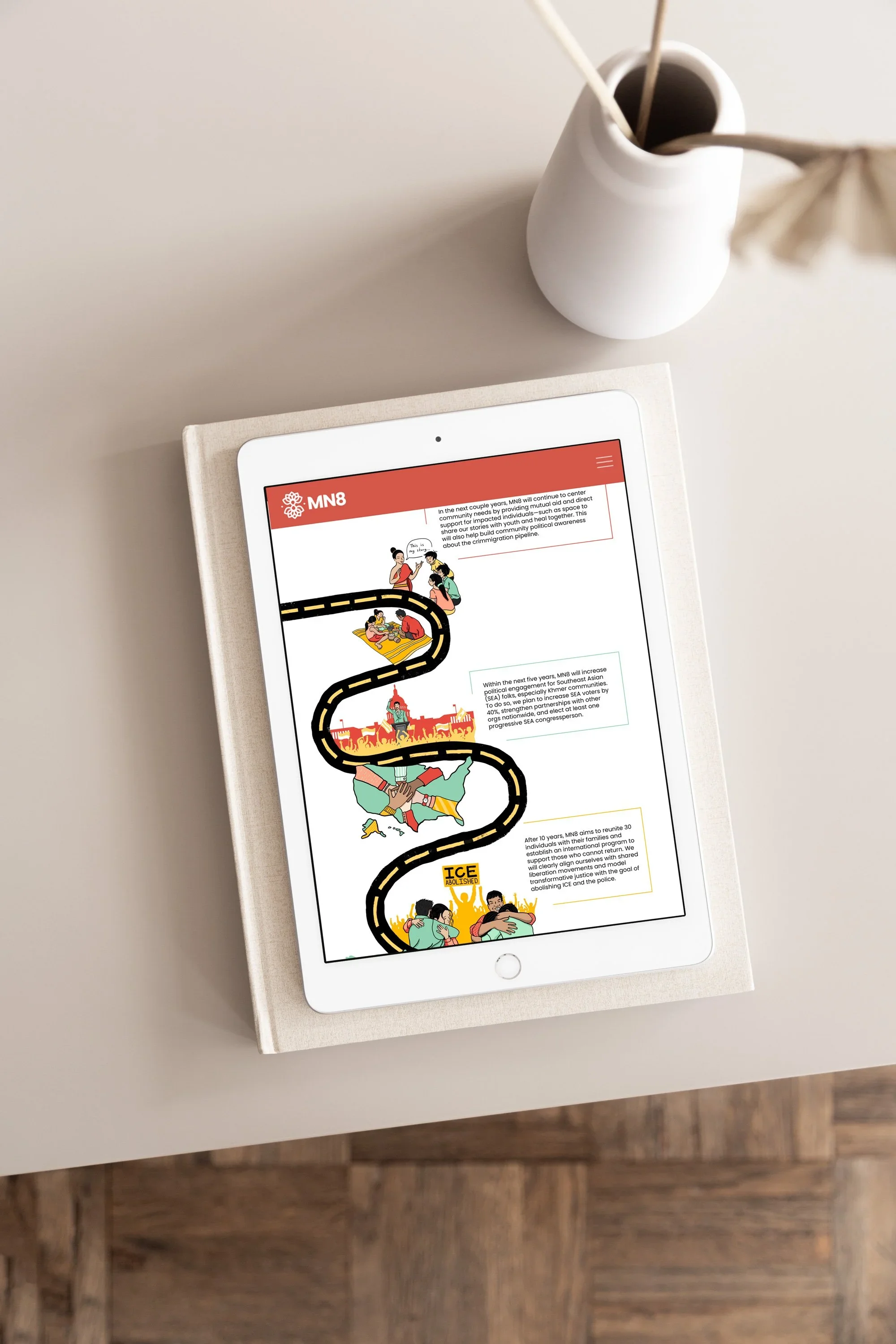
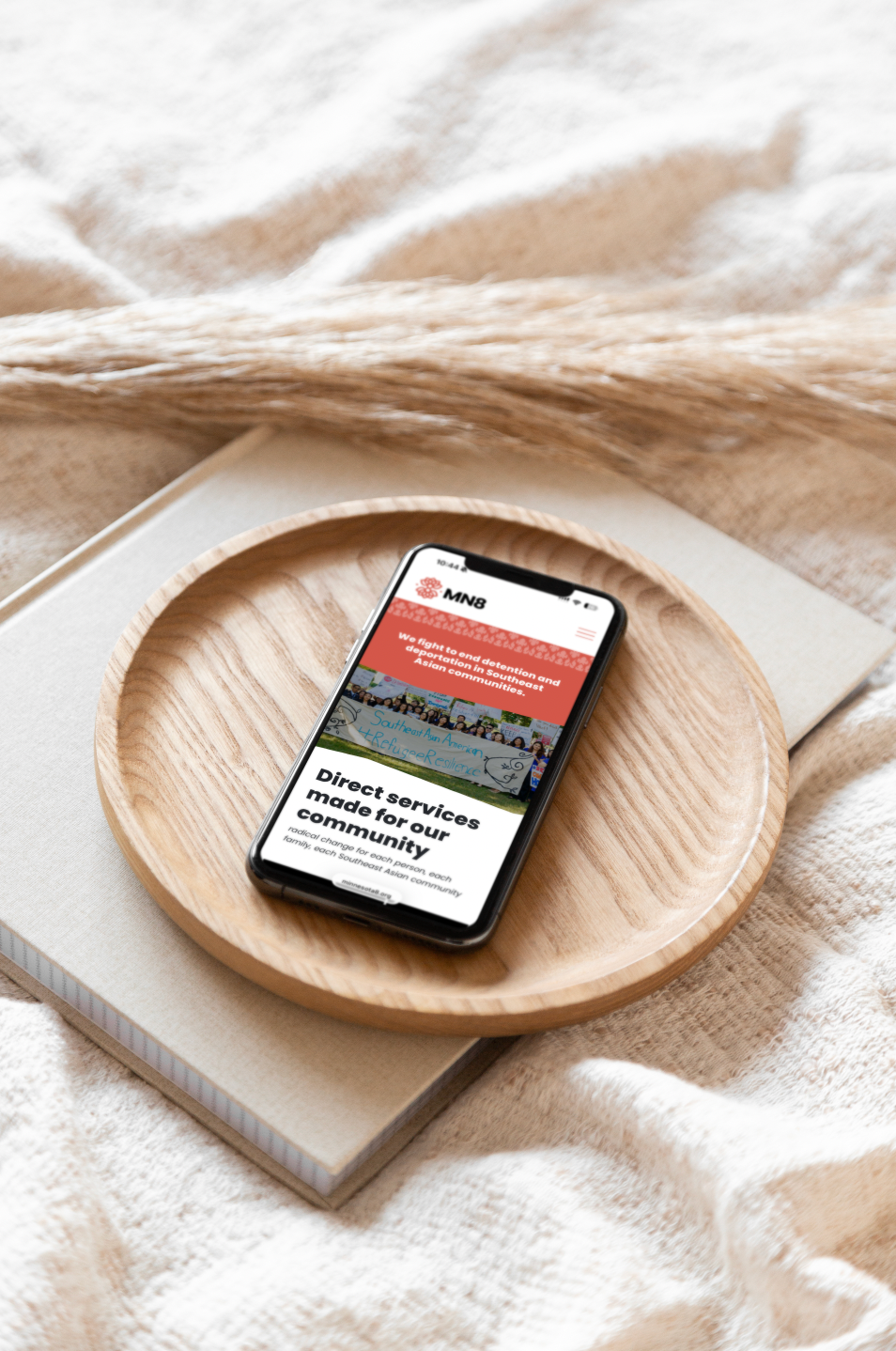
The final identity system extended beyond the logo itself to include typography, color, illustrations, patterns, and digital applications that could be used consistently across communications, advocacy efforts, fundraising initiatives, and community programs.
The updated brand and website provided a stronger platform for storytelling, engagement, and organizational growth while helping leadership communicate the organization's mission with greater clarity, confidence, and consistency.
Years later, MN8 continues to use the brand and website as a foundation for its work while expanding its reach and impact.
Perhaps the most meaningful measure of success came from the organization's leadership itself. The Executive Director chose to have the symbol tattooed, a reflection of how deeply the identity resonated and how authentically it captured the spirit of the movement.
Before and After