Elevating an established
wealth advisory firm
PROJECT SUMMARY
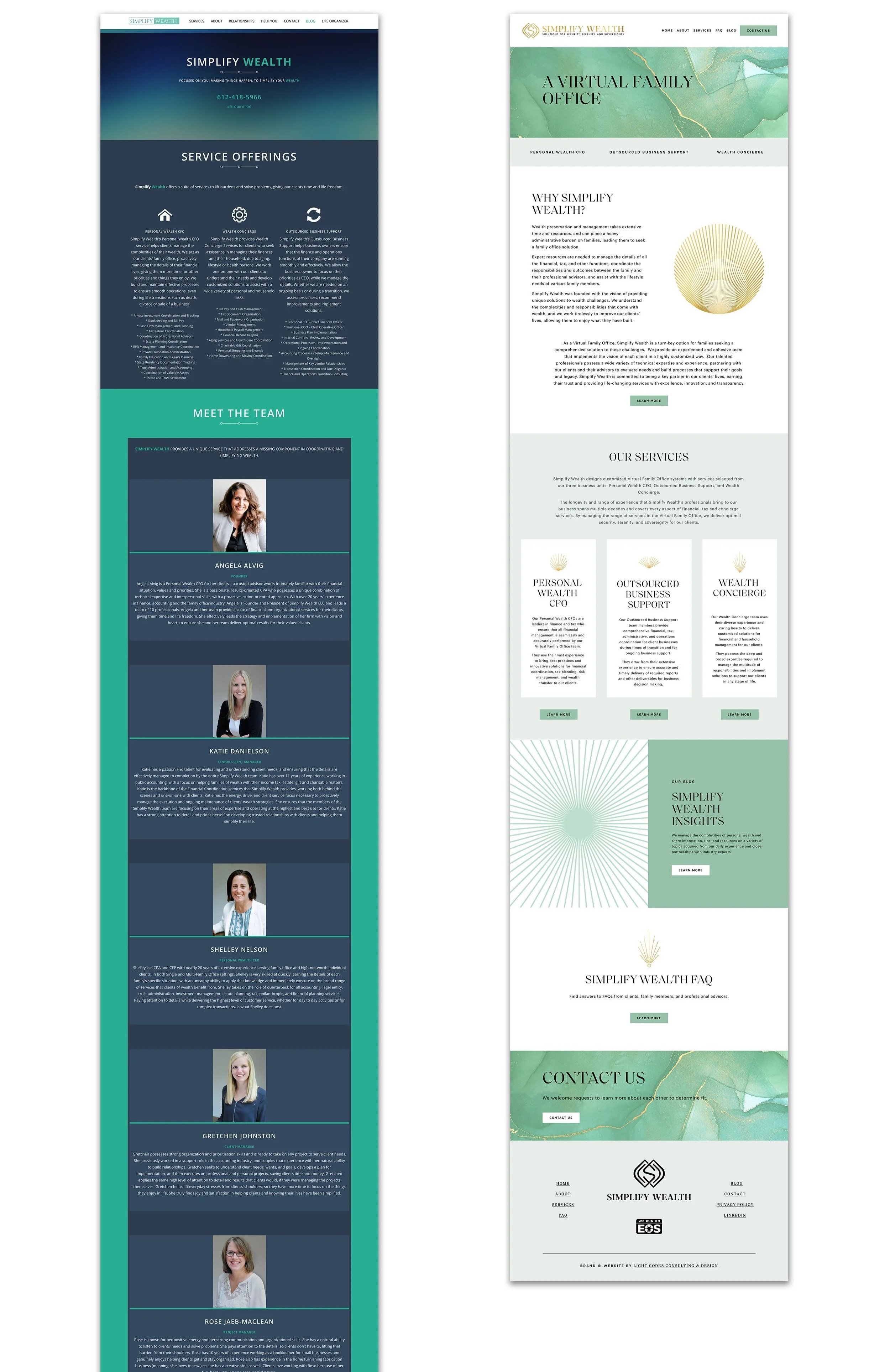
Simplify Wealth partnered with Light Codes to transform an outdated brand and website into a more elevated, intentional, and trustworthy experience that reflected the caliber of clients they serve.
The engagement included brand strategy, visual identity design, sacred geometry integration, website design, and supporting collateral. Together, these elements created a cohesive brand foundation designed to strengthen credibility, communicate expertise, and support the firm's continued growth.
“I can't say enough of how happy we are with the end product. We have a new, fresh look while staying true to our roots.”
— Tonja Sahaydak, Client Manager at simplify wealth
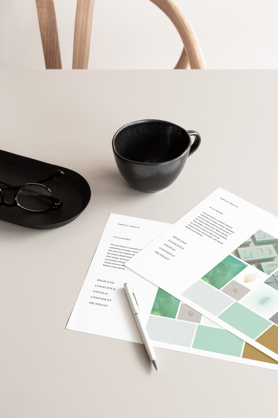
THE OPPORTUNITY
As the firm continued to grow, its existing brand and website no longer reflected the level of expertise, trust, and sophistication that had become central to its work.
While Simplify Wealth had established itself as a trusted advisor for individuals and families navigating significant financial decisions, its visual presence failed to communicate that same level of confidence and credibility. The challenge was not simply creating a more polished appearance. It was developing a brand capable of expressing trust, clarity, and professionalism while helping prospective clients feel supported through some of life's most important financial decisions.
OUR APPROACH
Trust, abundance, structure, and intentionality became guiding principles throughout the project.
Working closely with the founder, we explored how sacred geometry could be incorporated in a way that felt meaningful while supporting a refined and professional financial brand. Through strategy, stylescapes, and visual exploration, we developed a direction that balanced sophistication with approachability, helping clients feel both confident and supported.
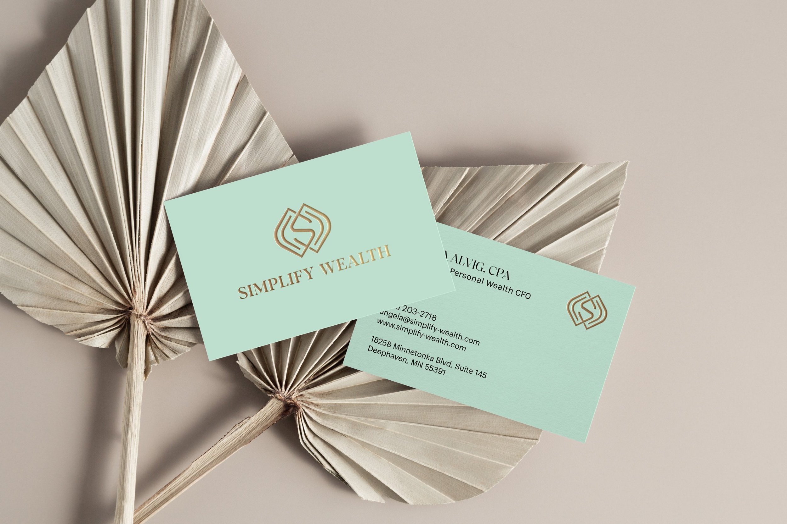
sacred GEOMETRY logo
At the center of the identity is a custom sacred geometry symbol built around three interlocking forms that subtly integrate the initials “S” and “W.”
The geometry was intentionally designed to communicate structure, stability, connection, and strength, qualities that closely reflect the role Simplify Wealth plays in helping clients navigate complex financial decisions. The interlocking forms create a sense of alignment and balance while expressing the relationship between thoughtful planning, trusted guidance, and long-term financial well-being.
Rather than relying on traditional financial imagery, the identity uses geometry as a visual expression of order, intentionality, and confidence, creating a symbol that feels both timeless and distinctive.
FROM SYMBOL TO EXPERIENCE
While the logo provided the symbolic foundation, the broader visual direction was designed to communicate confidence, abundance, sophistication, and trust.
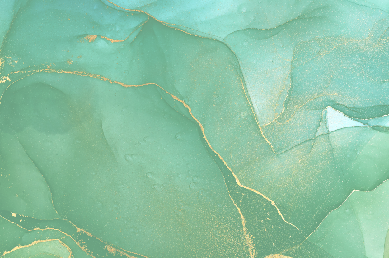
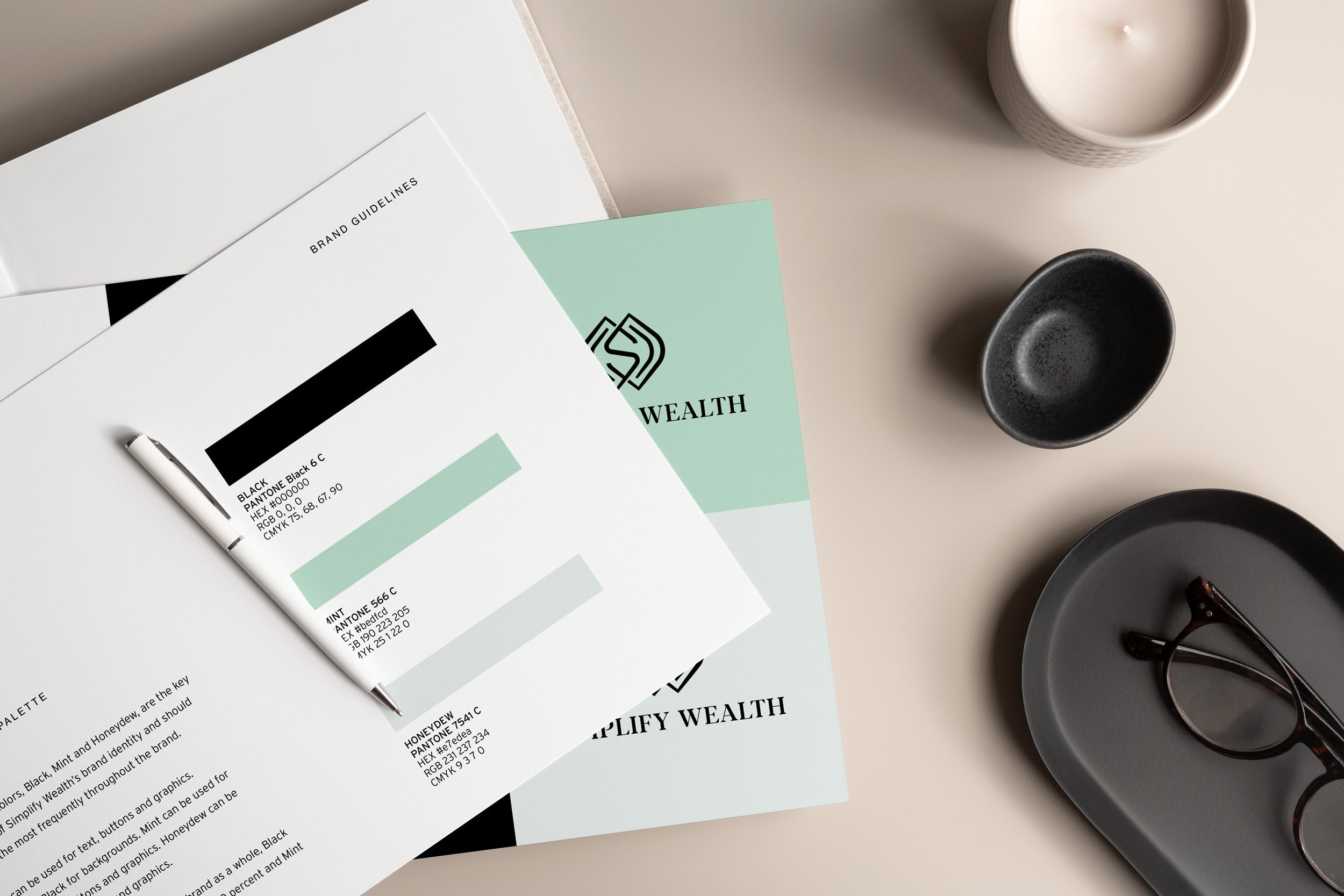
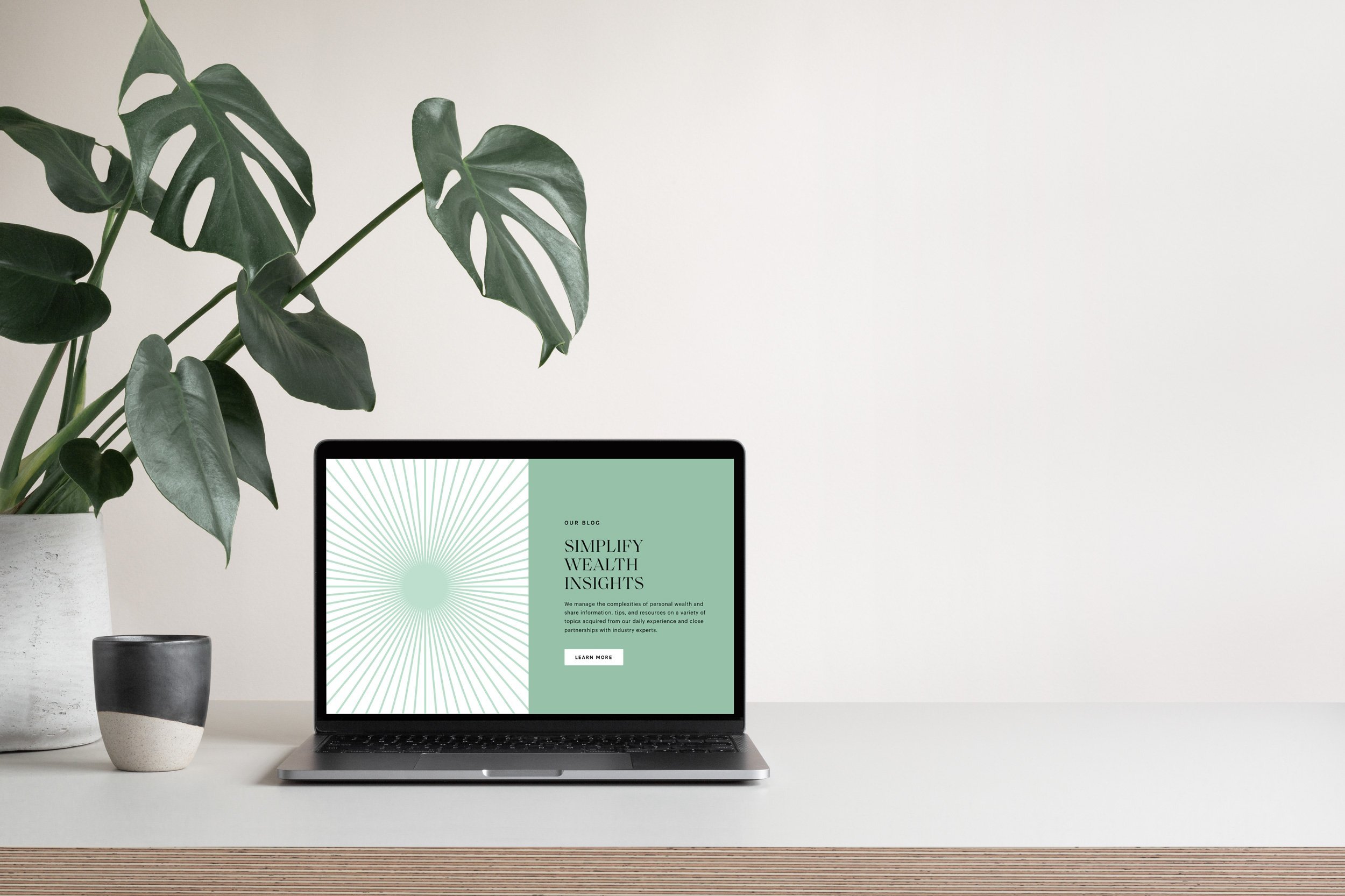
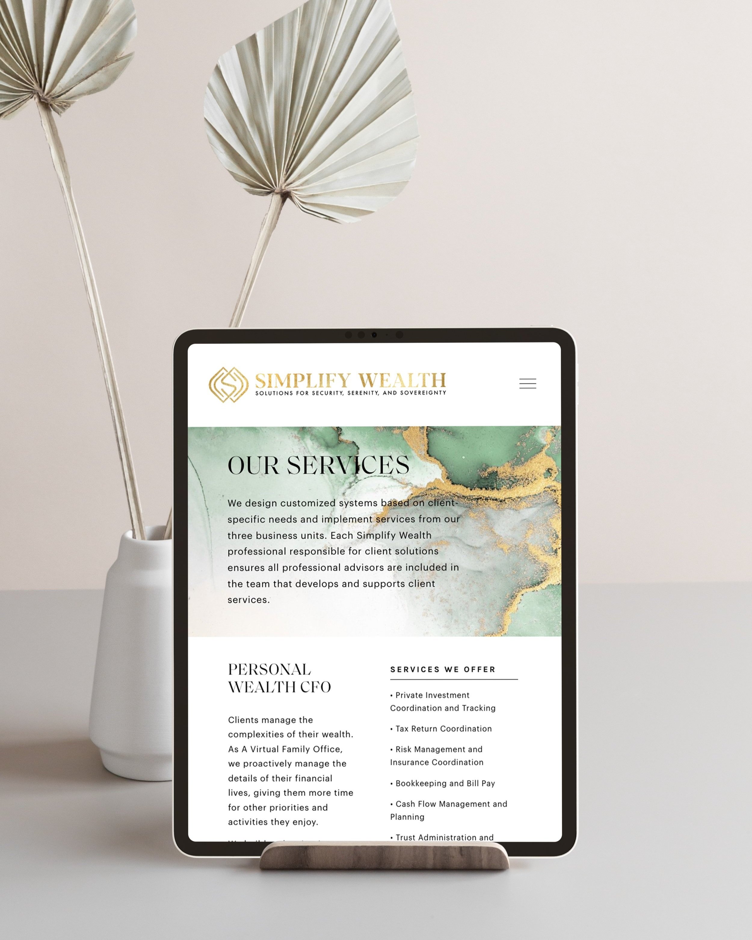
Sacred geometry became a recurring element throughout the brand system, extending beyond the logo into supporting graphics, collateral, and digital applications. Gold accents reinforced quality and prosperity. The result is a visual language that feels elevated, intentional, and enduring while remaining approachable and human.
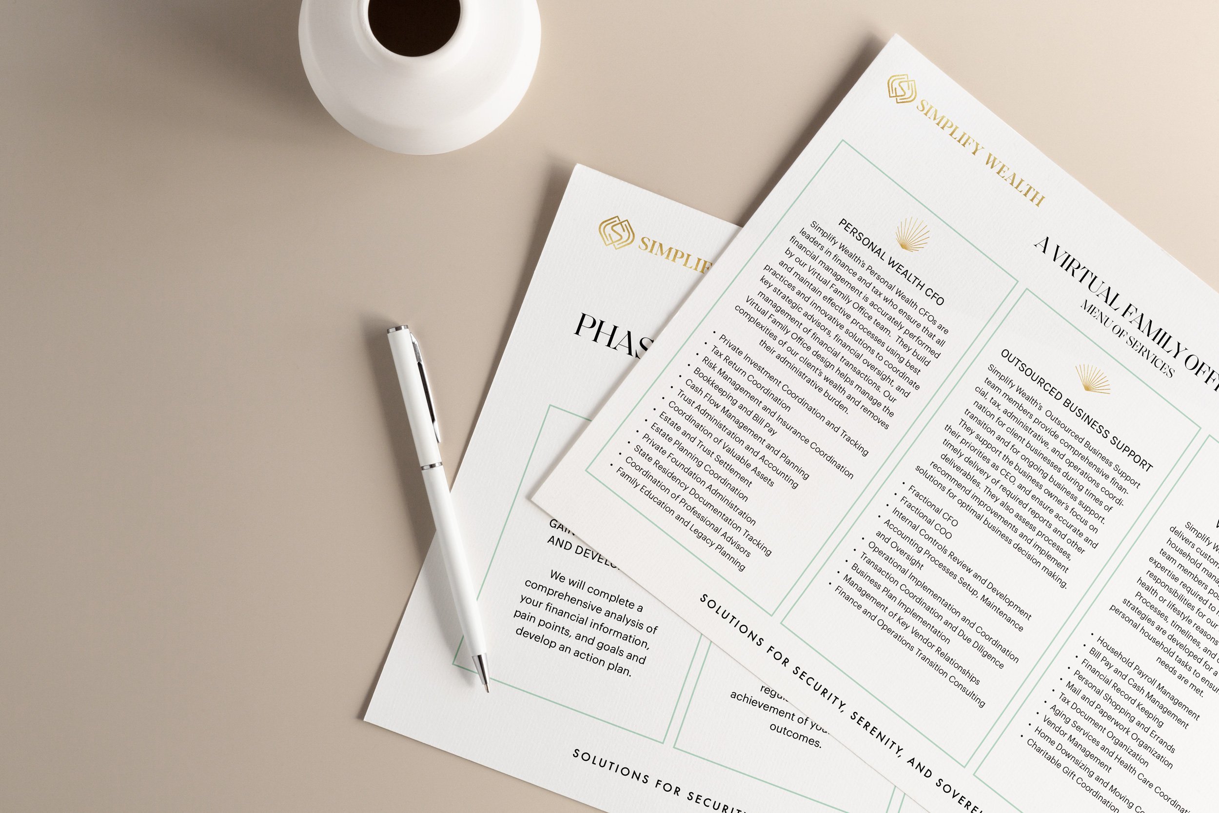
Project Scope
Brand strategy, visual identity, sacred geometry, website design & development, marketing materials
Project details
THE OUTCOME
The final brand system created stronger alignment between the quality of Simplify Wealth's services and how the firm was being experienced by prospective clients.
The identity extended across the website, marketing materials, and client-facing communications, creating a more cohesive and professional experience while strengthening trust and recognition. Years later, the firm continues to use the brand as the foundation of its marketing and client experience while continuing to grow and expand its team.
Perhaps the strongest measure of success is the ongoing relationship itself. Following the success of Simplify Wealth, the founder returned to partner with Light Codes on a second venture, Securing Freedom, entrusting us once again to help shape the next evolution of her vision.
Before and After